The Hiking Project
Developing a new feature to obtain a business goal
ROLE
One of two UX designers: Head researcher
DURATION
2 weeks
CATEGORY
Mobile
Some background
The Hiking Project is a platform aimed at users seeking out hiking trails and information about their key characteristics. The mobile application is designed to navigate the user to trails and keep them on-path even while offline. Our team was assigned to hone in on one or more key features to develop that would meet a business goal.
The problem
Some initial content analysis revealed The Hiking Project has a few issues, mainly with its UI and key features. Above all, their user base is quite small for some of their most important features to be useable, reliable, and accurate. The Hiking Project needs more streamlined social features so users can make safer, more informed decisions.
How might we redesign or introduce a key feature to increase usability and functionality for users which enable them to make safer, more informed decisions?
The solution
It begins with features that allow users to feel safe and informed. The app relies heavily on user-inputted data which we shall develop upon to create a much more social feel. Hikers rely on one another to upload comments, photos, conditions, and other statistics on the hiking paths they have traveled.
The process
I began by personally using the Hiking Project application in real-time to understand the current experiences offered and to familiarize ourselves with our users’ processes. I also did a bit of initial competitive analysis by simultaneously using competitors in the field. After building a substantial foundation, my partner and I conducted user interviews to further empathize. Our candidates were familiar with hiking in general and using the top competitor in the field All Trails.
Competitive analysis
We took a deeper look at the competing apps and laid out some prominent features to analyze how the Hiking Project performed amongst its peers. This revealed what it lacked and we were able to analyze the features it did have e.g. comments were available but difficult to find; There are pictures displayed on the Hiking Project trails but there is no clear way if any, to take and upload your own.

User interviews
-
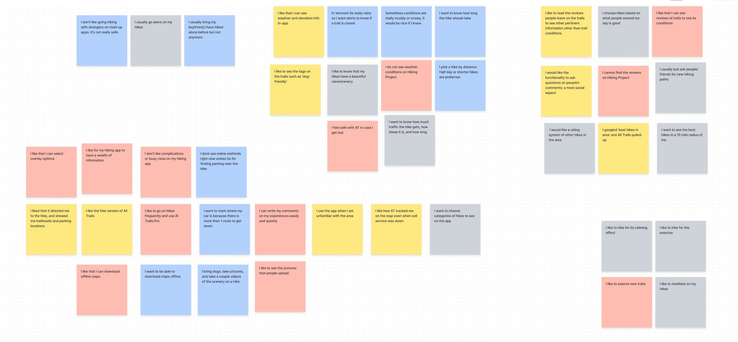
1) I want to be informed
When seeking out new trails especially, our users strongly felt the need to be informed about the trail’s characteristics and conditions, which should be updated on a regular basis.
-
2) I value my peers’ opinions
Users valued the opinions and reviews laid out by those who had traveled the path before them. That data gives users rich insight during the deciding process.
-
3) I want more features
There was a range of features they desired but most prominently they wanted more social interactivity. Adding photos, commenting on trails and specific details, sharing externally.
Personas
The trends uncovered through our user interviews and affinity mapping allowed us to build two solid personas that would guide our feature development.
-
He is very familiar with the outdoors and hiking in general so he has a high standard for what features the app should offer and include.
His goals include getting exercise, clearing his mind and to take some photos of flora and fauna along the way.
He needs and expects to know trail conditions beforehand, how long each hike should take, and some detailed information so he is well-prepared, i.e. what to pack, what shoes to wear.
-
Her interests include social activities and taking her young child and dog out for short hikes.Her goals include getting some light impact exercise, absorbing the natural scenes around her but above all she wants to document her journeys on social media, #doitforthegram.
She needs and expects to know the difficulty level so she can make sure her child can accompany her, where the bathrooms are located, and where to park her car. She also expects exceptional scenery so user-sourced imagery is a must.
Ideation and validation
Journey map
Utilizing our second persona Heidi (who might have the highest level of unfamiliarity with a hiking app), we created a journey map to expose key areas where improvements could be made.
The Hiking Project showed weakness in the areas of social interaction and user input such as user-sourced comments and above all picture uploads. There simply wasn’t an efficient or clearly present way to share activity and interact with data.
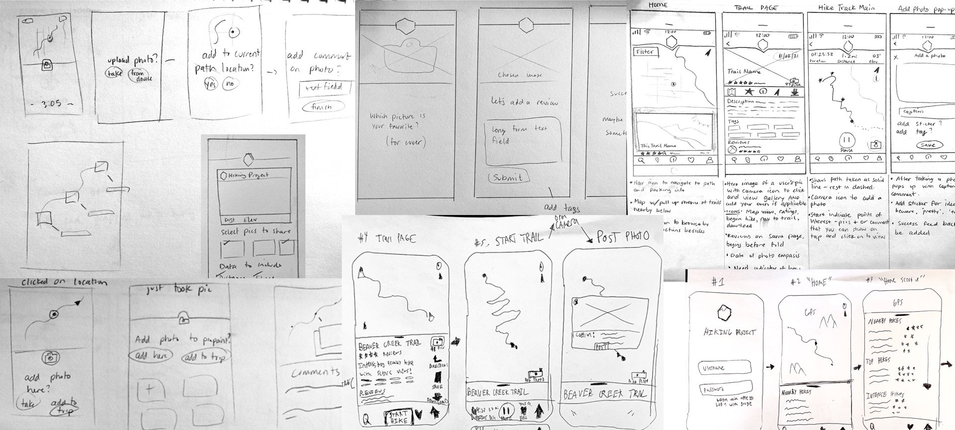
Focusing on the most glaring issue, we decided to hone in on the ability to upload photos, more specifically uploading photos that are geo-tagged which can alert and indicate to other users key areas of interest such as an important trail condition update or a beautiful photo opportunity. Our first design studio banged out quick ideas for how these screens would guide the user through this process and iterated on just how to make the screens the most efficient. I drew some more fleshed-out sketches of all the screens before we began wireframing digitally in Figma.

Low to mid-fidelity wireframes
-

Trail page
-

You are here
-

Add photo while hiking
-

Rate, comment, tag your hike
User test findings
After our first two, we identified some key problems with the affordances we had laid out. Users were not recognizing the capsule as a hotpoint that would open the drawer with trail categories and they clicked on the Explore icon instead. The overlay that popped up after taking your geotagged photo added some additional confusion — why is this even here and why do I need to X out of it? Some of the footer navigation also did not match up with the current state of the user’s flow. Our users also expressed confusion as to how the trail they were traveling on was downloaded in the first place. Hiking Project uses a system of ‘areas’ divided up by states that the user must download first before any trails are populated on-app. Executing the task flow laid out before them had no other snags.
A few initial changes were made
After those initial tests, we quickly made some augmentations. The drawer’s pill was augmented to look more like what is found on an iOS interface. The photo overlay was reduced down to a simple square that could be clicked to open up a preview of its caption and the option to delete which would be hidden upon clicking anywhere outside. We introduced a simple onboarding dialogue box that informed the user they must first download their preferred area to obtain trail maps for offline navigation.
Final high-fidelity prototype
We conducted another design studio session to colorize our wireframes. Initially, we branched outside of the norm of forest greens and dark mode backgrounds but decided on simple gradients and the incorporation of one simple mountain image in the footer navigation. Our tests proved successful.
Click to watch the final flow!

Next steps
Add in functionality to ask questions on user comments
Allow users to pose questions to those who left a comment on a trail
Incorporate push notifications for turning points on the trail
This would minimize the occurrence of becoming lost while losing focus
Build out the filters and search functionality
I would love to play around with the information architecture and test these actions


