Local Liquor Shop
Designing a functional e-commerce experience showcasing their highly-curated inventory to increase sales and gain new customers
ROLE
Sole UX Designer / Researcher
DURATION
2 weeks
CATEGORY
Web
Some background
Founded in 1990 with the namesake of its neighborhood, Andersonville Wine & Spirits has been slow to keep up with the changing market around them. Mom and Pops are increasingly falling victim to the churn of change around them as commercial giants gobble up their competition creating grotesque homuncului with unapproachable demeanors. These merchants are deeply embedded with and often form the fabric of the communities to which they belong which can supply them with the knowledge about their customers’ wants and needs.
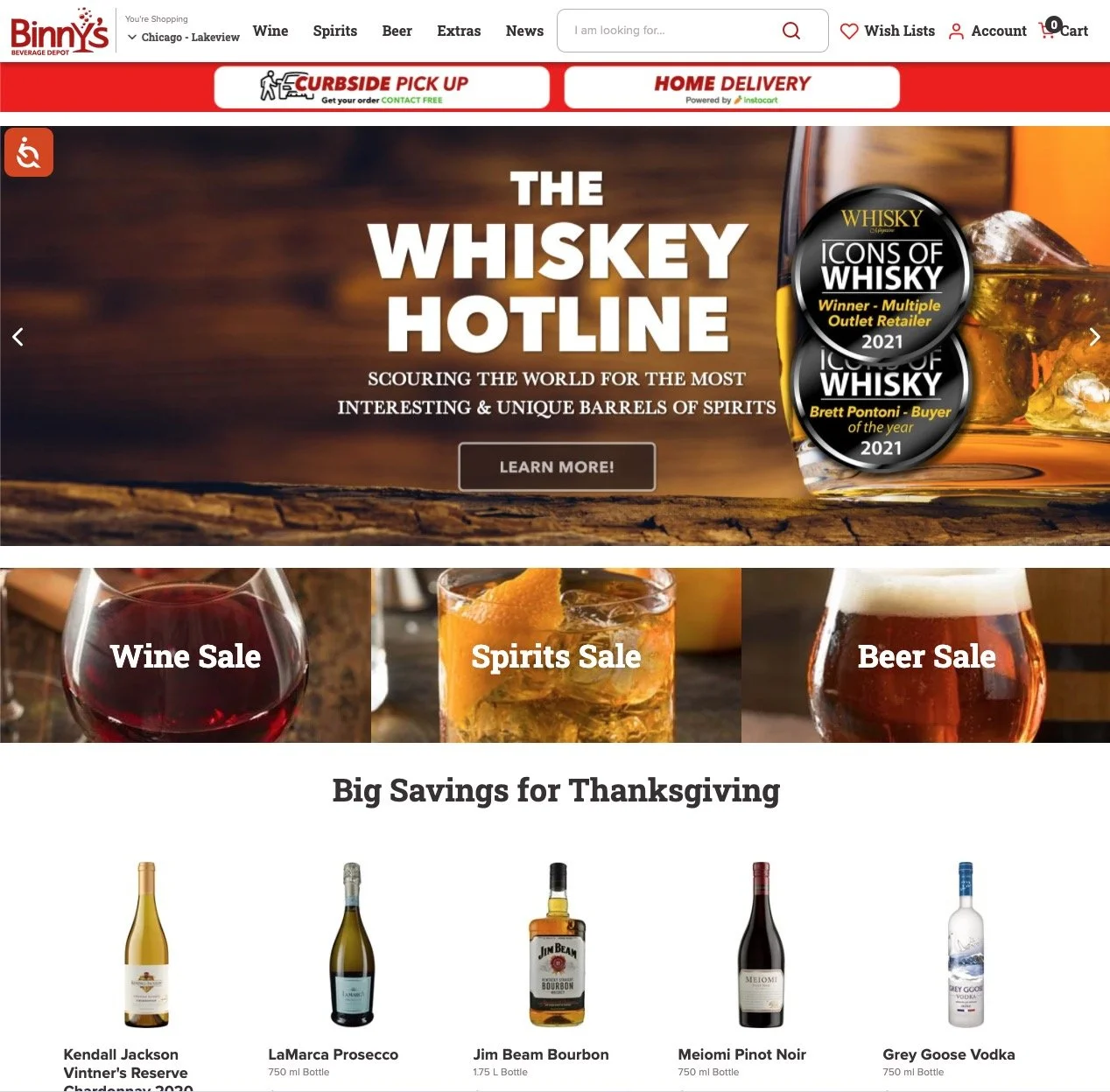
The current state of their homepage
The problem
The only information the website currently has is their address and other contact info but how might any visitor to that site know they are operating when the homepage is literally a 404 error message? This Local Liquor Shop needs a functional eCommerce website to increase sales, gain new customers, and engage with its community.
How might we modernize their business practices to connect to more users, make the purchasing process more efficient, and earn more revenue?
The solution
It starts with an online presence that is useful and desirable for all shoppers, where current and new customers can access a showcase of their highly-curated inventory. Upon that foundation, we can build an effective and efficient ecommerce platform that competitors have accustomed our users to. Users not only can view the showcase of AW&S products but also place orders for pickup and delivery.
Detective work
Warming up the cold shop owner
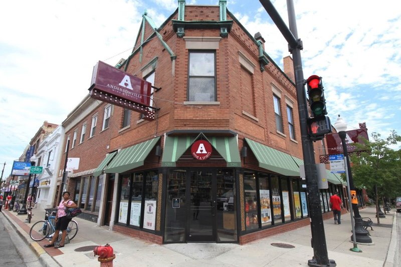
To kick off my empathic journey I took a short trip to the storefront aiming to snap some photos and possibly speak with an employee but the man behind the counter was the owner.
He denied me permission to take any photos
I undauntedly probed him with questions and explained my interest and value
He warmed up and began to reveal the reasoning behind the catatonic state of his website
Within 10 minutes he invited me behind the counter to view competitive websites with him
Competitive analysis
From the big-box liquor stores to small shops like this, liquor stores in the area offer well-designed, effective showcases of their products for users to peruse, research, and purchase what they like with the option of pickup and delivery.
I found a range of details and styles to deliver the necessary information on products. Some I found were too distracting and offered too many options and CTAs to click on. Some pages offered up information or options that I felt should be hidden and discovered at a later time such as pickup and delivery options.
I kept all these styles in mind during the rest of the designing process, while conducting the user interviews and especially during the crafting of my personas.
The Interviews
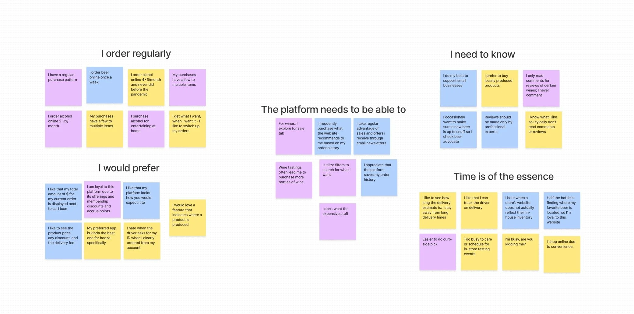
I needed more information on how users operate on the web when purchasing alcoholic products. I conducted three user interviews with regular users of competitors to ask what they look for, what they expect, how they inform themselves, and why they order online as opposed to going into the store. I utilized affinity mapping in Figma to reveal major trends. I chunked information based on the frequency of ordering, the information needed, and other preferences which revealed an overwhelming cry for convenience in the crunch of time.
Ease of use, familiarity, convenience, sprinkled with regular on-sale items, and earned reward points garnered loyalty. The ability to receive deliveries or schedule a pick-up ranked most important.
Platforms that remember their user by saving their past purchases for a quick reordering process and mining that data to suggest recommendations are also ranked highly.
My favorite response to a question about submitting reviews on past purchases that informed me on crafting my primary persona:
“I’m busy, are you kidding me?”
Creative work
The personas
To further exercise my empathetic connection I synthesized my research and created two personas that embody a fast and slow approach. Andrea has little time to putz around and Gus takes a more meaningful approach.
-
Product focused34 years old
Restaurant Manager
1 dog, 1 roommate
3flat at corner of Balmoral + Paulina
Product-focused, Bargain hunter
My primary persona is a woman on the go ordering for delivery. She’s a busy gal who knows what she likes.
• She is product-focused and very short on time and dislikes cognitive overload.
• For out-of-the-ordinary purchases, she needs a quick and easy way to see what’s on sale or inexpensive as she is also budget conscience.
• She’s known to branch out and add on to her usual order with for-sale items or may splurge on a recommendation.
-
The browser57 years old
Network Security Engineer
Wife, 3 adult children (out of home)
Single family home at Thorndale + Ravenswood
Browser, Researcher
Gus on the other hand is a newcomer to the website, he’s physically seen the shop before but never visited.
• He is browsing around, maybe to purchase a gift for a neighbor or have wine delivered for a night in with his wife.
• His goal is to establish trusted local purveyors in the area he can rely on when he decides to purchase alcohol for any occasion be it right now or in the future.
• He dislikes eCommerce products that supply insufficient information or have no reviews.
The sketches
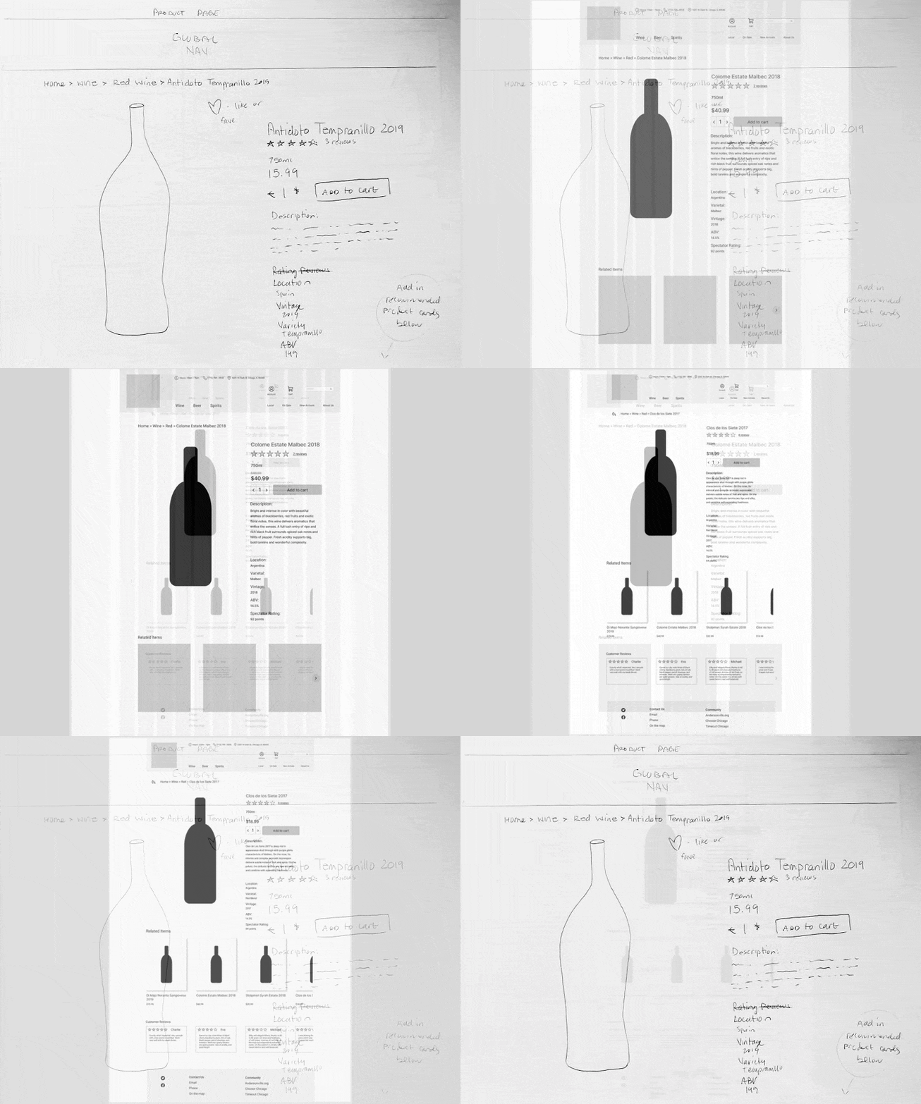
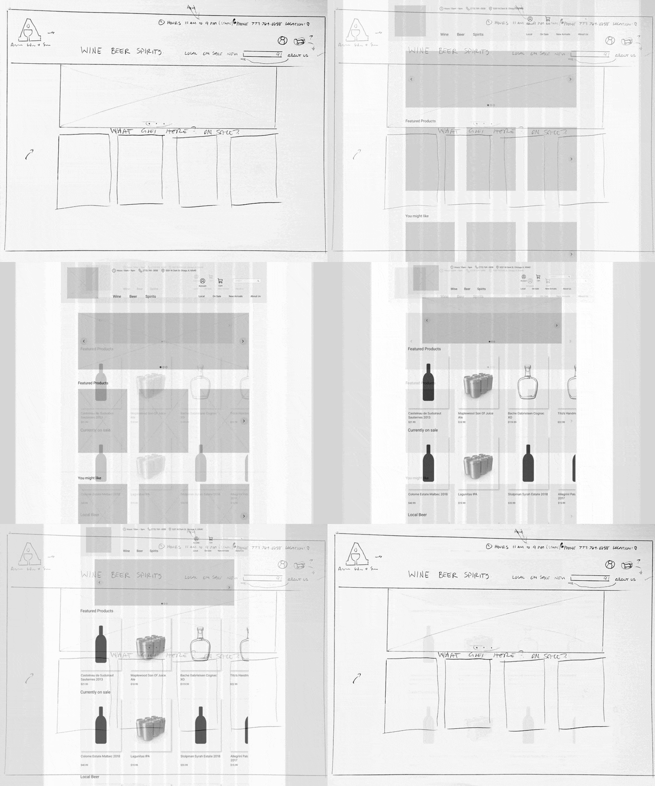
My wireframing process was to create a frankenstein of all the best components of competitor and comparative platforms. I pared down the unnecessary to leave a clean, straightforward interface that swiftly allows users to fulfill their needs whether that be a quick and seamless reorder or researching and discovering new products.
Evaluative work
Task flows were created matching a typical ordering process for both personas. Andrea is a busy gal who knows what she wants, which is a reorder of her past purchase, find a new inexpensive bottle of wine to tack on, and get it delivered. Gus is a newcomer to this Local Liquor Shop and wants to establish trust first; he explores the inventory and eventually decides on a few items to pick up in-store.
Flow 1 — Andrea
Flow 2 — Gus
The tests, the errors
To address the confusion with the horizontal scrolls, I added a tinted background using the main maroon color and added some navigational arrows.
The readability needed to be addressed. I can be a fan of smaller font sizing to maximize negative space however users need readable text to complete any and all tasks. The menu items were sized up considerably, keeping in mind those who have less than perfect vision.
The back arrow to the left of the breadcrumbs was supplemented with a clear label to make its use more apparent.
Problems resolved
The redesign of their website supplies customers with a desirable and effective way to not only browse the showcase of curated items but also efficiently purchase those items for pick up in store or to get delivered. Although there were some hiccups and undesirable flaws in the design, all six users were able to complete their respective task flows and successfully place orders.
Next steps
• My next steps would be to fully flesh out a system of sorting and filters to aid further in user searches. I am tempted to also automatically alphabetize the products however I feel I should research the effectiveness of that as opposed to having that simply as a ‘sort by’ option and have the default sort of the products by popularity or another characteristic.
• The reward system and newsletter aspects of my design were barely touched upon. Given more time I would develop clear indications that you may sign up and receive points, how to receive them, and easy access to the current newsletter on the webpage with archiving.
• Community connectivity was also a goal that was not fully realized. I included some links in the footer with the intention to discover articles where AW&S was mentioned, community help and events, etc. however it was still quite a bit lacking. I intend to add a link to the menu about in-store events such as tastings.
